Understanding UI/UX Design
UI (User Interface) and UX (User Experience) design are crucial for creating products that users love. While UI focuses on visual elements, UX encompasses the entire user journey. Together, they create intuitive, beautiful, and functional digital experiences.

UI vs UX: The Difference
User Interface (UI)
- Visual design and aesthetics
- Colors, typography, icons
- Buttons, forms, animations
- Brand consistency
- How it looks
User Experience (UX)
- Overall user journey
- Information architecture
- User research and testing
- Usability and accessibility
- How it works and feels

Core UX Design Principles
1. User-Centered Design
Always design with the user in mind:
- Understand user needs and goals
- Conduct user research
- Create user personas
- Test with real users
2. Consistency
Maintain uniformity throughout:
- Visual consistency (colors, fonts)
- Functional consistency (interactions)
- External consistency (platform standards)
3. Hierarchy
Guide users through content:
- Visual hierarchy with size and color
- Information hierarchy
- Clear navigation structure
4. Feedback
Keep users informed:
- Loading indicators
- Success/error messages
- Hover states
- Progress indicators
Essential UI Design Principles
1. Simplicity
- Remove unnecessary elements
- Clear and concise content
- Minimize cognitive load
- "Less is more" approach
2. Visual Hierarchy
- Size: Larger = more important
- Color: Contrast draws attention
- Spacing: White space creates focus
- Typography: Font weight and style
3. Alignment
- Create visual connections
- Use grid systems
- Maintain consistent spacing
- Professional appearance
4. Contrast
- Make important elements stand out
- Ensure readability
- Guide user attention
- Meet accessibility standards

The Design Process
1. Research
- User interviews
- Competitor analysis
- Market research
- Analytics review
2. Define
- Create user personas
- Define user journeys
- Identify pain points
- Set design goals
3. Ideate
- Brainstorming sessions
- Sketching concepts
- Creating wireframes
- Exploring solutions
4. Prototype
- Low-fidelity prototypes
- High-fidelity mockups
- Interactive prototypes
- Design systems
5. Test
- Usability testing
- A/B testing
- Gather feedback
- Iterate and improve
Typography Best Practices
- Use 2-3 fonts maximum
- Maintain readable font sizes (16px+ for body)
- Ensure proper line height (1.5-1.6)
- Limit line length (50-75 characters)
- Use font hierarchy effectively
- Consider web-safe fonts
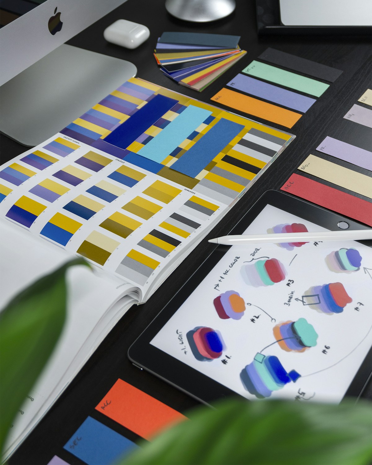
Color Theory in UI/UX
- Primary Color: Brand identity
- Secondary Colors: Supporting elements
- Accent Colors: CTAs and highlights
- Neutral Colors: Backgrounds and text
- Use 60-30-10 rule
- Ensure accessibility (WCAG standards)
Mobile-First Design
- Design for smallest screen first
- Progressive enhancement
- Touch-friendly interfaces
- Optimize for performance
- Consider thumb zones
- Simplify navigation
Accessibility (A11y)
- Color contrast ratios (4.5:1 minimum)
- Keyboard navigation support
- Screen reader compatibility
- Alt text for images
- Clear focus indicators
- Avoid relying solely on color
Common UI/UX Mistakes
- Ignoring user research
- Overcomplicating interfaces
- Poor navigation structure
- Inconsistent design elements
- Slow loading times
- Not testing with real users
- Neglecting mobile experience
- Poor error handling

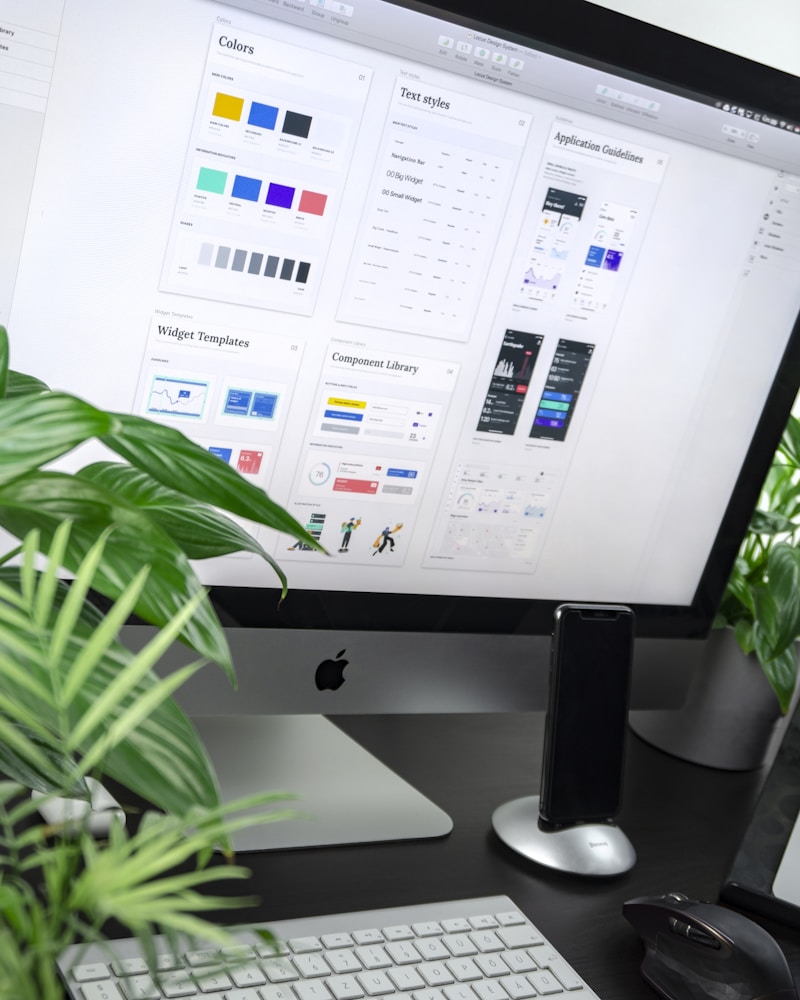
Essential Design Tools
Design Software
- Figma: Collaborative design tool
- Adobe XD: UI/UX design and prototyping
- Sketch: Mac-based design tool
- InVision: Prototyping and collaboration
Prototyping Tools
- Figma, Adobe XD, InVision
- Principle for animations
- ProtoPie for interactions
User Testing Tools
- UserTesting.com
- Hotjar
- Maze
- Optimal Workshop
Design Trends 2026
- Neumorphism and glassmorphism
- Dark mode as standard
- 3D elements and illustrations
- Micro-interactions
- Voice user interfaces
- AR/VR experiences
- Minimalist design

Conclusion
Great UI/UX design is about creating intuitive, accessible, and delightful experiences for users. Focus on understanding your users, maintaining consistency, and continuously testing and iterating. Remember: good design is invisible – users should accomplish their goals effortlessly.